Lead generation is one of those things that a lot of marketers just feel does not have a lot of complexity. A person needs something, you put a form in front of him or her, and then you’re done for the day - simple.
And it is dead simple - if you’re horrible at it.
If you’re good, you know this area can get pretty complex pretty quickly - and you that you need all the help you can get. Here are two things to keep in mind:
Use graphics deliberately to make the CTA explicit

The call-to-action is the reason your page exists – it’s what you want visitors to do on the page. If your visitors cannot figure out what to do because your CTA is unclear or there’s clutter around it, then you’re losing leads.
Make sure the picture in the background does not dominate the scene, and that the form is not so bland against the color graphic. The CTA should naturally arise from the Zen-stillness of your page.
Affordable-Home-Insurance.org’s CTA button stands out from the rest of the page, and immediately grabs the visitor’s attention.
Another thing to keep in mind is that faces will get attention. We will always look at faces because they’re a rich source of information about the environment. We have a general object recognition system, and near our emotional mid-brain, we have a separate part for recognizing faces and people. That allows us to judge someone’s attitude or aggression towards us, and this is all critical for social and survival reasons.

MR Insurance Consultants' photo of a woman gazing towards the form directs the visitor's attention to the CTA area. On your page, the direction of the gaze of the face matters. Generally, you don’t want photos of people looking past your form or off the page. They direct the attention elsewhere, and will be taken as a signal of something interesting on the page. So, you want photos of people looking in the direction of your form or your CTA, instead.
Shorten the form (or at least make it appear short)
Don’t try to get all of the customer’s information in one shot.
Before you add that extra field into your form, ask yourself, “Is this absolutely necessary to complete the transaction?” If it’s information you can get from the customer later on in the process when you’ve built some relationship with them, then get rid of that additional field.
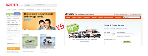
U-HAUL and PODS are both in the moving and storage business, yet the former asks for very little information. U-HAUL’s form looks easier and less invasive by asking only for essential information.
In the real world, you wouldn’t want to be rude or too forward. So don’t ask for too much information, too early in the process when there’s no obvious benefit for the customer to give up that information.
For downloads, you don’t even have to get any information from the visitor. You can let them download your whitepaper freely, so it can go viral and you establish your thought-leadership in the process. If you don’t gate your content, people can see your CTA at the end, and then you can ask them for their information.
If a lot of information is necessary, experiment with staging the form in different ways. Consider dividing the form into separate screens or a lightbox pop-over sequence (e.g. one screen for contact information, another screen for personal information, and so on).
Also, make sure your form is free from security questions or CAPTCHA. They’re just another hoop for your customer to jump through and are barriers to conversion.
Boring and short work in Lead Gen
It's critical that other graphic elements of your page don't compete with your CTA for attention, so visitors know right off the bat what they're supposed to do. Also, remember - you’re not your visitor’s doctor. You don’t need all that information, certainly not at the start of the process. If you keep your lead generation pages relatively boring and short, you’ll be better off.
4 Tips for Creating an Effective Call to Action
If you work in marketing or digital operations, the call to action (CTA) is something of a rock star. We test it. We revere it. We understand that a small lift in click-throughs for it can mean significant gains for the business.
And yet a quick Google search for CTA will pull up results for the Chicago Transit Authority, the California Teacher’s Association, the Cherenkov Telescope Array, and a slew of other results, while our little rock star—the call to action—is nowhere to be found on page 1.
The reality of the call to action is that while there’s now more attention paid to it compared to, say, 10 years ago, we could still be thinking about it and optimizing it quite a bit more.
Below are four tips to help you go beyond just testing your CTA button color:
1. Contrast
The first lever that you can turn when testing versions of your CTA is contrast. Note that we’re not specifically talking about colors. Colors are absolutely a factor, but even if red tests better than green, that doesn’t mean red converts better in a general sense. Red may have more contrast against the colors used in your theme.
It’s important to have mostly a color-neutral presentation—benign and boring works quite well for most sites, and you’ll have more leeway to make the CTA more distinctive when using a “bland” page.
2. Choices
The second lever almost does not need to get mentioned: for your CTAs to be found, you need to limit choices. Limit the potential actions of your visitors. One is ideal, and two potential actions can be forgiven if you absolutely need the second choice.
Any more than that and you’re just confusing your visitor. Remember: if you prioritize everything, you prioritize nothing.
3. Affordance
Contrast and choices (or the lack thereof) will help visitors spot buttons. Visual affordance tells visitors what they can do with those buttons.
For the latter, you have several options available:
• Shape: rounded objects call a little more attention and convey a little more interactivity
• Size: greater sizes typically help give buttons more attention and hierarchical “weight”
• Position: negative space around buttons help visitors understand that the area can be interacted with
For your CTAs to work, two things need to happen. First, visitors need to be able to spot them without any effort. Second, visitors must instantly know what they do—affordance, limited choices, and contrast are required, but they are the bare minimum. You need more.
4. Intent
Don’t underestimate the importance of matching intent. This sounds complicated (and it often is) but there are simple things you can start with. At a bare essentials level, that means making sure your calls to action are indeed actions. For instance, there’s a difference between “Free Trial” to “Try it Free.”
You might be surprised at the difference in click-through rates between the passive versus the more action-oriented one.
If you want to dive deeper, you can go through the usual tools you have for crafting emotional messaging. In an example case for the Clinton Bush Haiti Fund, just changing the form CTA from “Submit” to “Support Haiti” increased dollars donated per visitor by 15.75%.
Yes, emotions matter a lot in conversion.
Making it Count
Optimizing web sites often call for tests on the CTAs, and that’s absolutely required. But once you know that you need to test, and once you actually have the tools required to test, there’s still the matter of knowing exactly which levers you are turning for your tests.
With contrast, choices, affordance, and intent, you have a complete set of tools to test to make your CTA